Bookside
Project overview
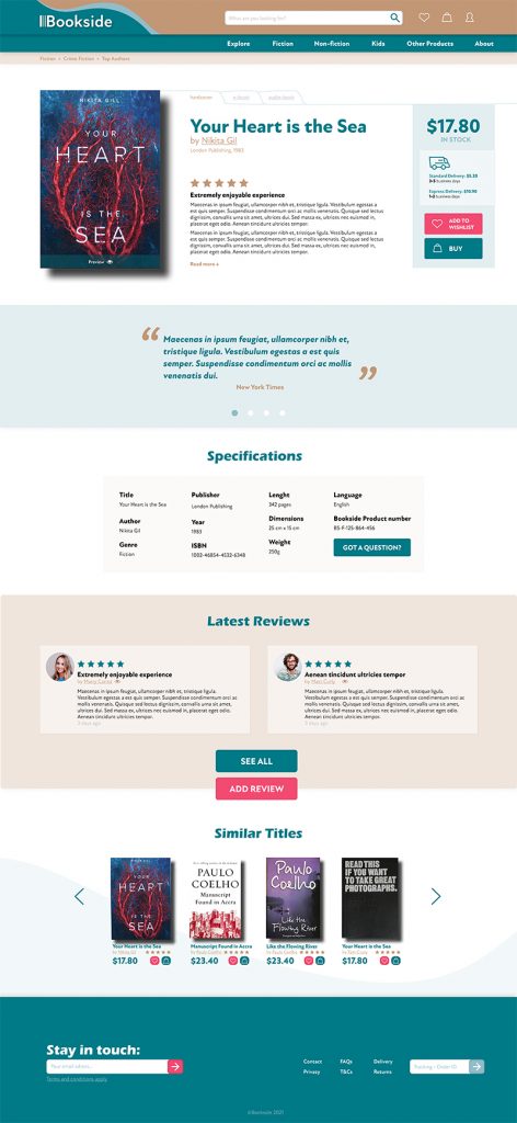
Selecting your next book becomes increasingly challenging in a world with an abundance of options. Bookside, an online bookstore, steps in to assist users in making informed decisions about their reading choices. A notable feature allows users to create an account to receive personalised book recommendations based on their interests and past purchases. Additionally, users can discover and follow like-minded readers for more book suggestions and reviews.
My role
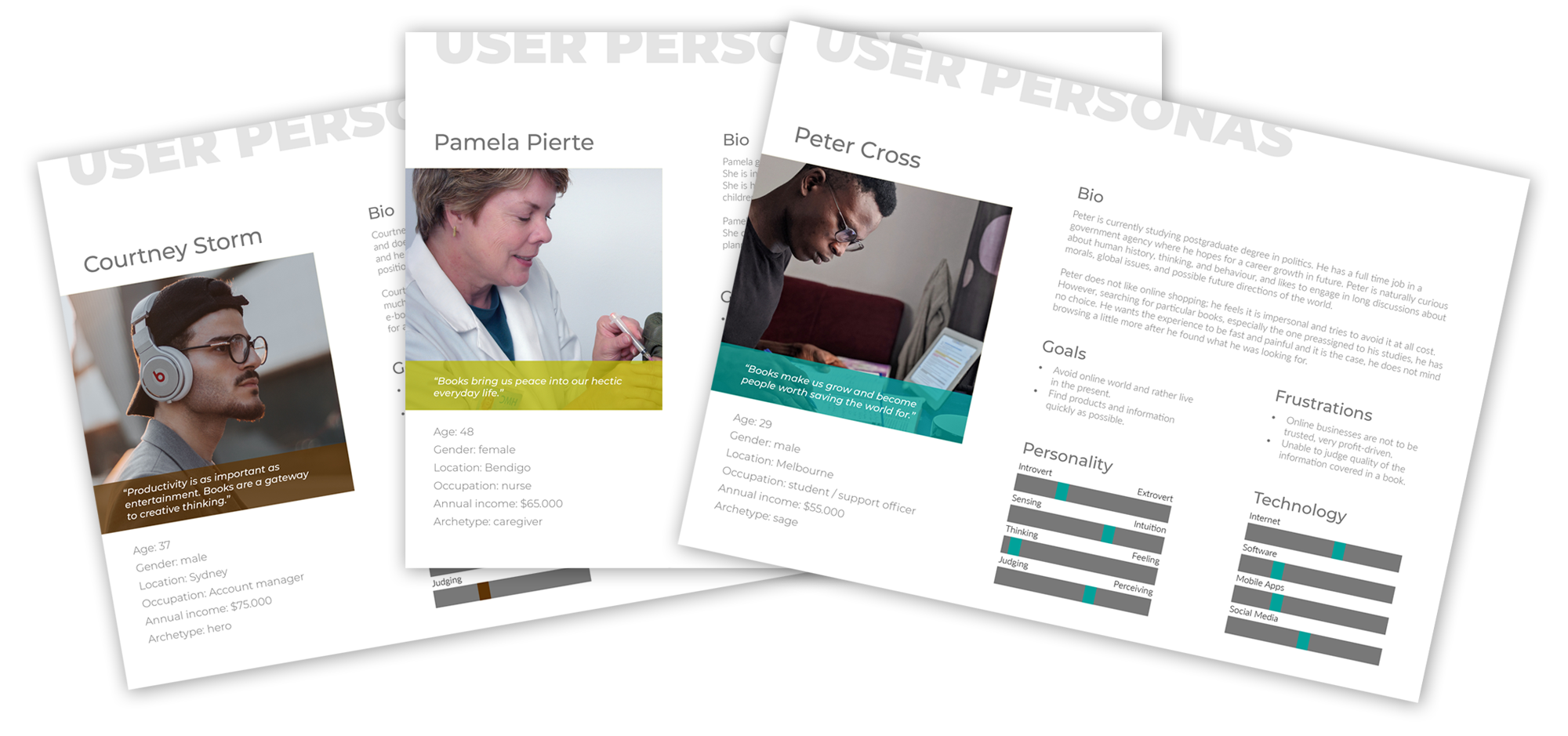
I was the sole designer behind this project, responsible for everything from coming up with ideas, conducting research, creating user personas, scenarios, and use cases, structuring the website, branding, and designing the user interface.
Research
To better understand book shopping behaviour, I started by visiting physical bookstores to observe their layouts and how customers select books. I also analysed competitor websites to understand what users expect and what pitfalls to avoid.
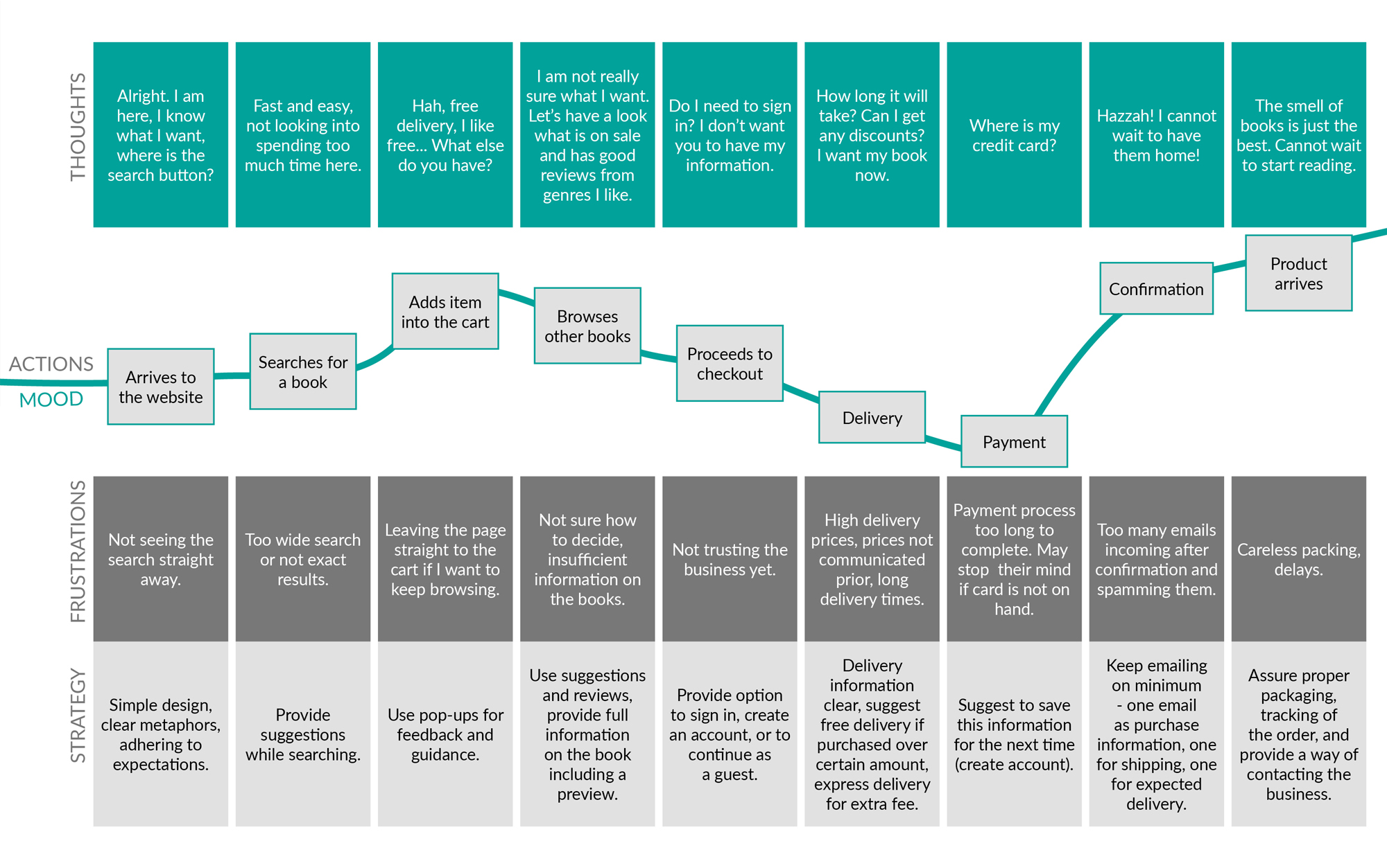
I conducted primary research in two phases. Firstly, an online survey gathered insights about online book shopping and the key factors influencing decisions. Interestingly, I discovered that online bookstores don’t often breed customer loyalty, indicating an opportunity if the right value is offered.
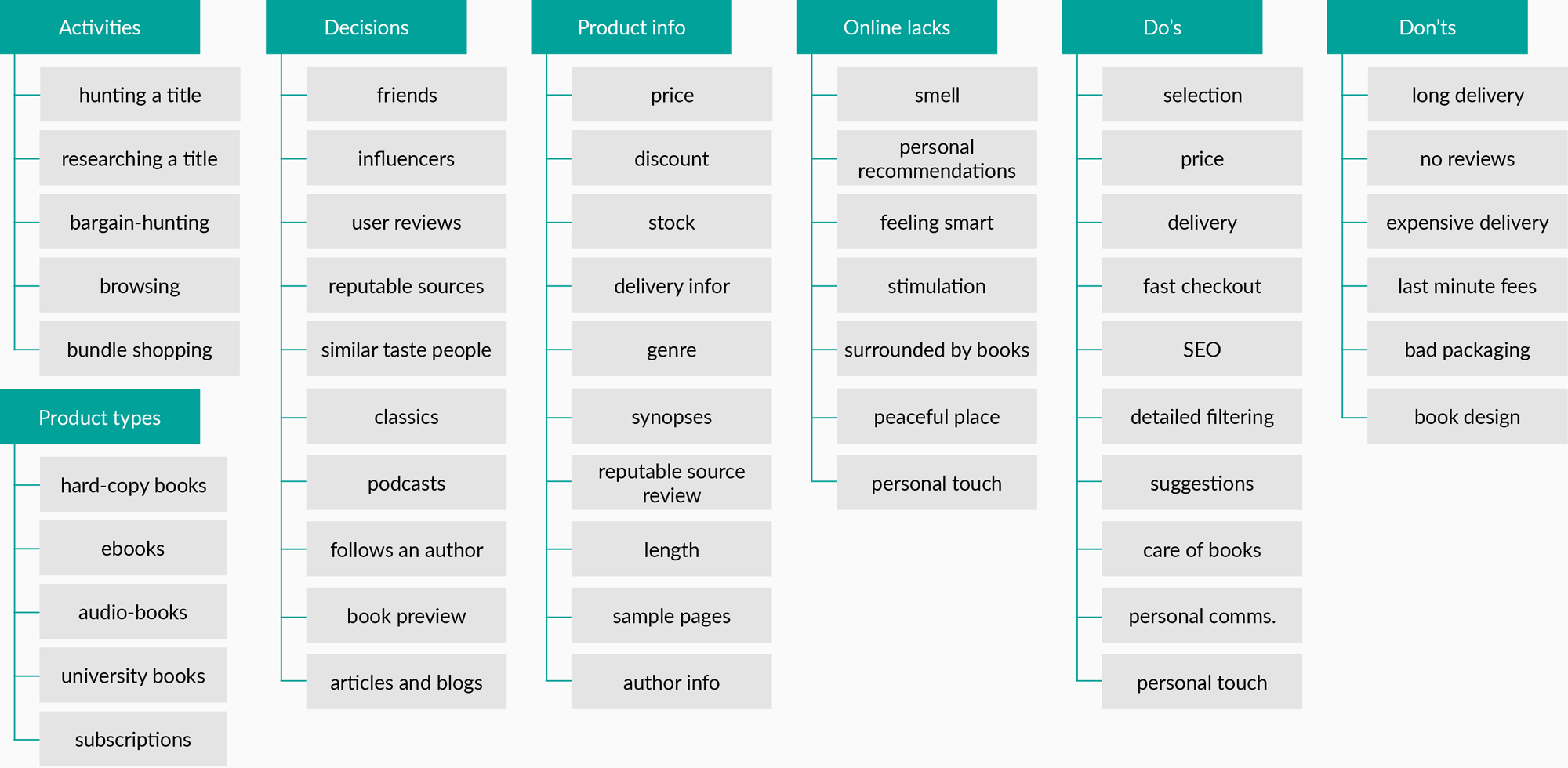
Qualitative data were then collected via focus group which further explored reasons people choose to buy books online, the information they rely on for their choices, and their past experiences. It became evident that personal recommendations and user reviews play a crucial role in decision-making and user satisfaction. This research provided the basis for shaping the website’s structure and features.
Element of differentiation
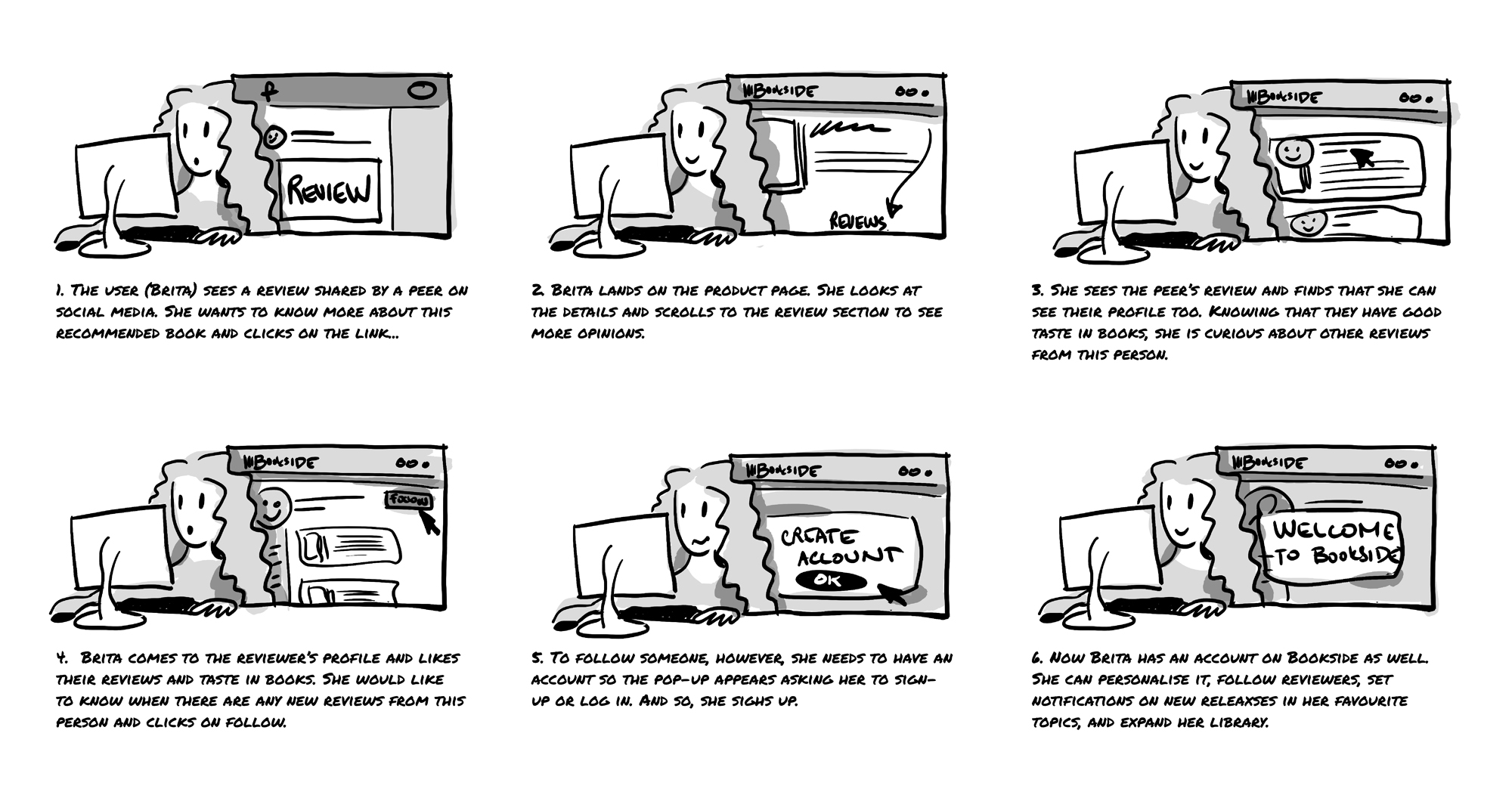
Building upon my research, I decided to accentuate book recommendations. This involved creating curated lists of the ‘top ten titles’ on various topics, compiled by employees, influencers, and opinion leaders, leveraging user reviews. Users can also create accounts to document their interests and book reviews and connect with others who share their reading preferences for additional book suggestions.
Layout and wireframes
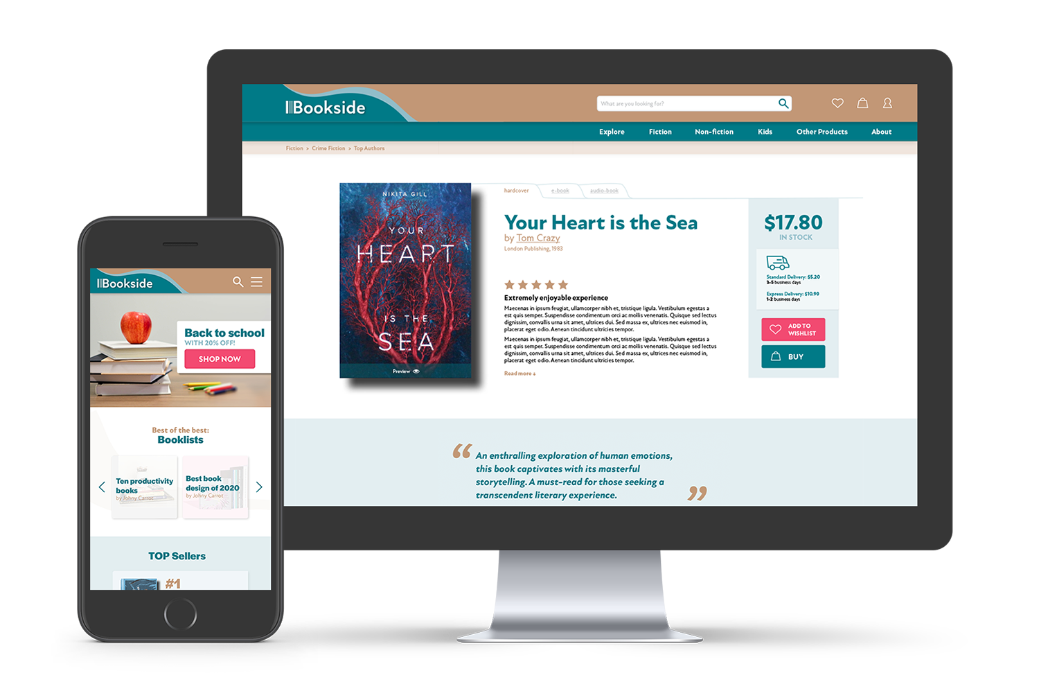
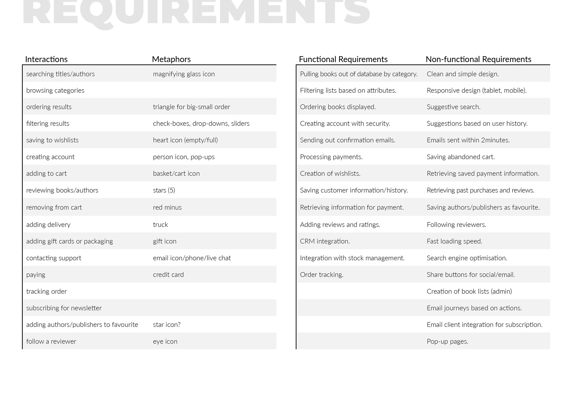
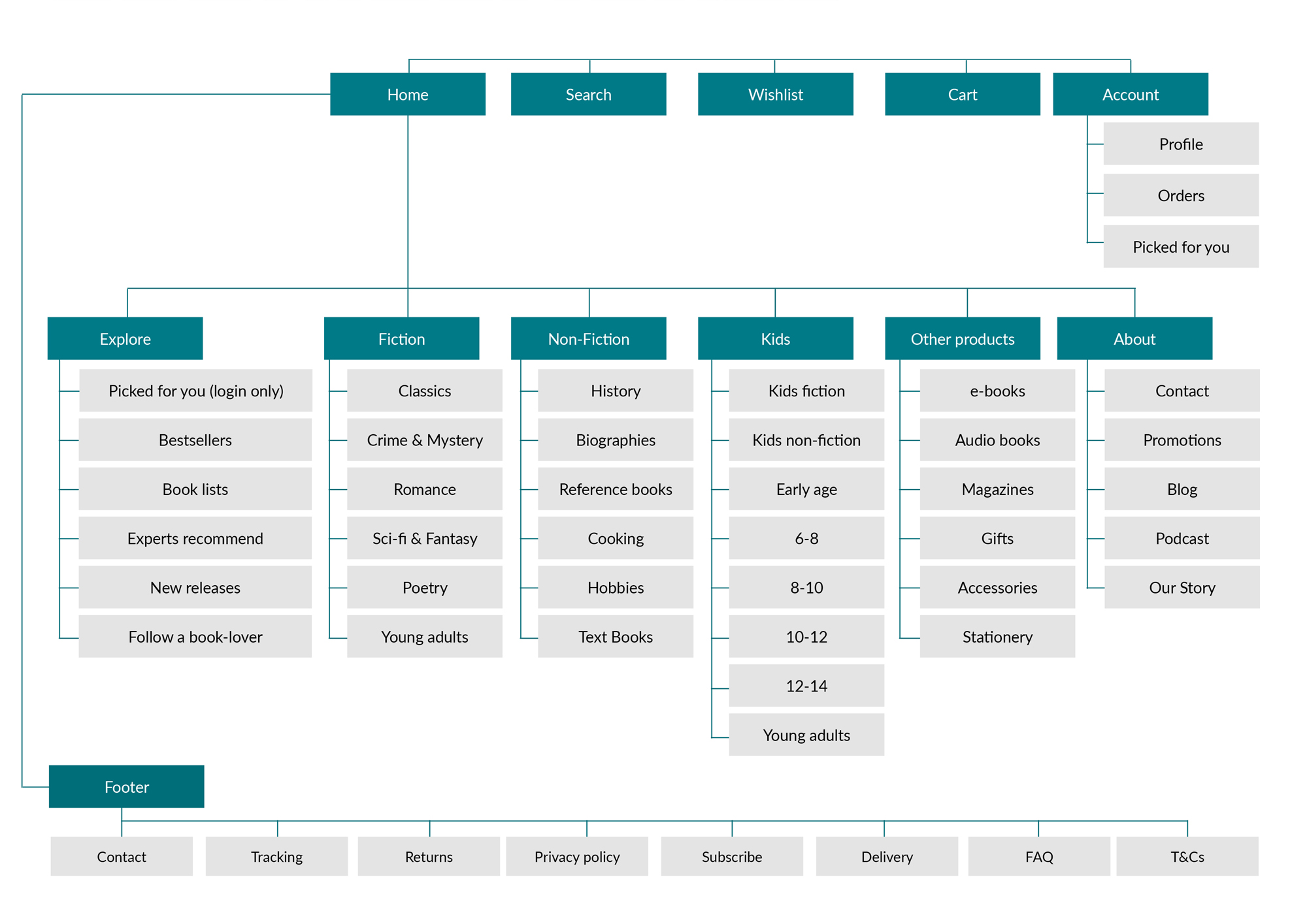
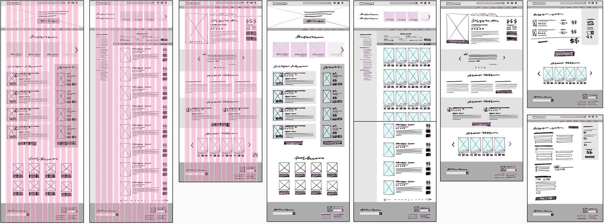
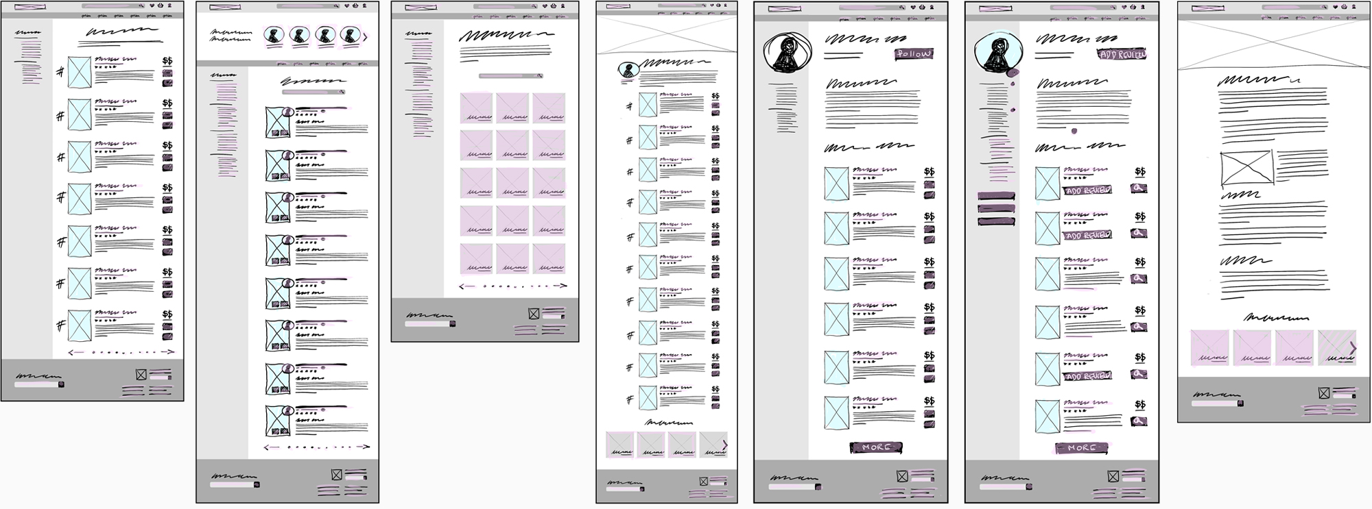
The user interface was based on a twelve-column grid so it could be developed using Bootstrap. The content pages were categorised into a number of layout templates that can be repeated across similar content to create consistent look.
Testing, evaluation, design iteration
Wireframes and the low fidelity prototype were evaluated with test subjects using a set of questions covering key aspects of usability and design such as aesthetics, ease of use, relevance, readability, reflection and information architecture. Second evaluation was conducted using Nielsen’s Heuristics. The testing uncovered several issues that were addressed in final designs, such as the need for breadcrumbs, adjustments to category headings, additional sharing pathways and increased use of white space.

