The Where
Project overview
Amid the global pandemic, cities witnessed a significant drop in foot traffic, leaving businesses struggling to regain their vibrancy. In response, this project aimed to develop a gamified mobile application that motivates young people to explore Melbourne’s CBD. Users embark on a captivating journey, deciphering clues to uncover hidden ‘secret’ spots on a concealed map.
My role
I was the sole designer behind this project. My responsibilities included concept development, comprehensive research, the creation of user personas, user journeys, and user flows. I also took charge of branding, interface design, prototyping, user testing, and multiple rounds of design refinement.
The Where concept
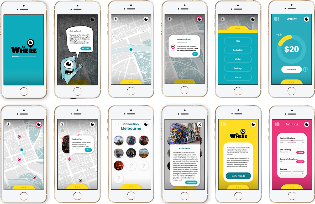
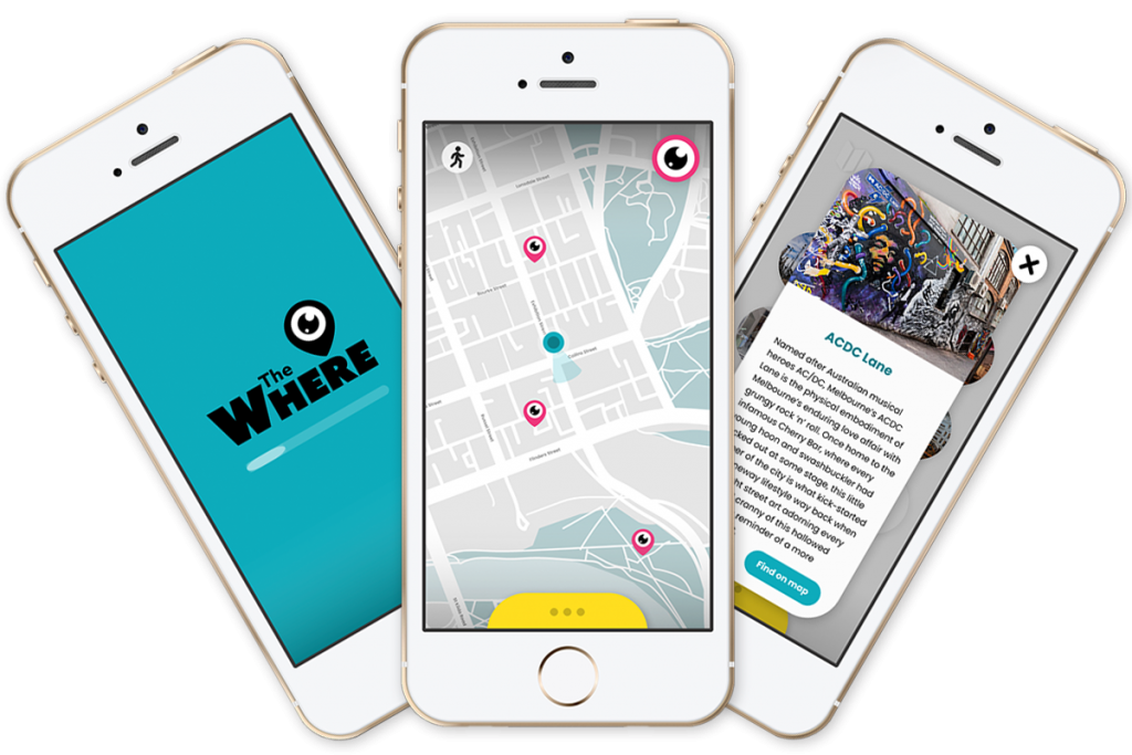
The application uses geolocation technology to provide users with clues that guide them through Melbourne’s hidden gems, from iconic landmarks to eateries and bars. Users start their adventure with a blank map and receive two levels of clues: one for spots within a one kilometre radius and another for places within one hundred metres. Upon reaching the desired location, the app provides instructions on how to ‘claim’ it using augmented reality, codes, or the microphone. As a reward, users earn a dollar value to spend at partnering locations.

User research
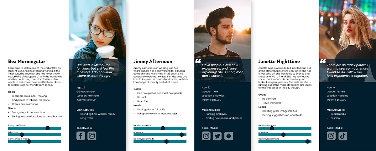
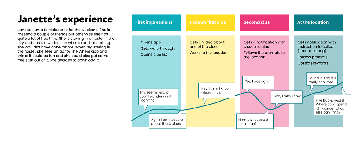
The project took off with initial secondary research and a focus group. The insights gathered in this phase significantly shaped the concept, precisely defining the target audience and providing a deeper understanding and motivation for app usage, such as discovering photo-worthy spots. These findings played a crucial role in crafting user personas, scenarios, journeys, task flows, and initial wireframes.
App name
The app’s name conveys its location-based The app’s name conveys its location-based nature and the intriguing element of mystery associated with looking for hidden gems. It carries an informal, almost colloquial tone to resonate with the target audience. Moreover, “The Where” is a subtle reference to “Neverwhere,” a novel exploring the enigmatic and secret underworld of London.
Branding and visual identity
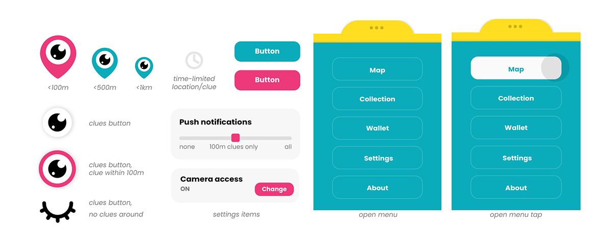
The main element of the visual identity is the app’s logo, which combines a ‘searching eye’ with a location pin. This simple metaphor effectively communicates the app’s concept and is seamlessly integrated into various interactive elements of the app. The logo exudes a bold, fun, and friendly character, while the chosen colors align with this ideology.

Field testing
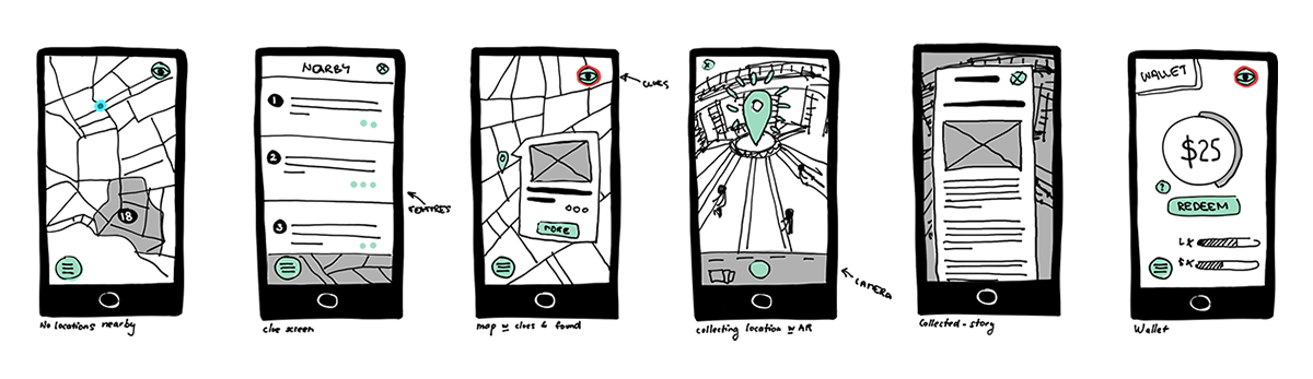
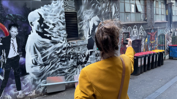
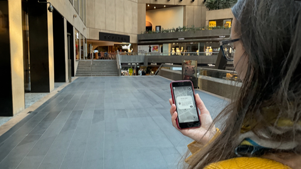
The initial testing phase involved creating a black-and-white prototype of the application in Figma. A pre-testing session helped unearth technical issues, refine testing scripts, and gather initial feedback. Subsequently, field testing was conducted with four target audience members. One participant tested the entire app flow by visiting all ten proposed locations while the other three engaged in a simulated environment.
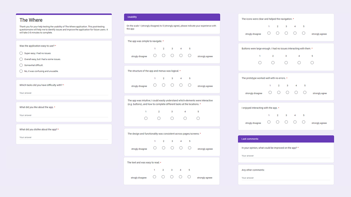
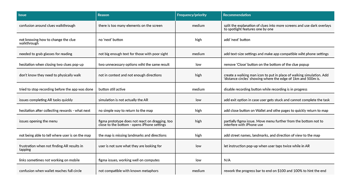
Following testing, participants completed post-testing questionnaires, providing comprehensive feedback. The results were transcribed, analysed, and prioritised to guide recommendations for changes to the app’s design and functionality. These recommendations encompassed additions and refinements of icons, adjustments to the map design, copy updates, and alterations to the placement of interactive elements.
Iteration, focus group, iteration…
Building on the insights gathered from testing, I refined the prototype and transformed it into a full-colour design. A second round of testing and a focus group provided valuable insights into further issues and opportunities for enhancement, ensuring an enjoyable and seamless user experience.
You can try out the prototype below. To simulate walking, navigate to the map and click on the ‘walker’ icon in the upper left corner.