PinPic
Project overview
PinPic is an innovative social media platform with a focus on travel enthusiasts. This unique platform serves as a hub for users to share their travel experiences with family and friends, offer recommendations, and draw inspiration from fellow globetrotters. Users can keep their network updated on their journeys, tag specific locations, and explore captivating destinations, all within the PinPic community.
My role
This is an individual project. From concept development and ideation to extensive research, creating user personas, scenarios, taxonomies, and task flows, everything you see is my work. I also created high and low-fidelity prototypes, conducted testing, and was responsible for crafting the platform’s logo and user interface design.
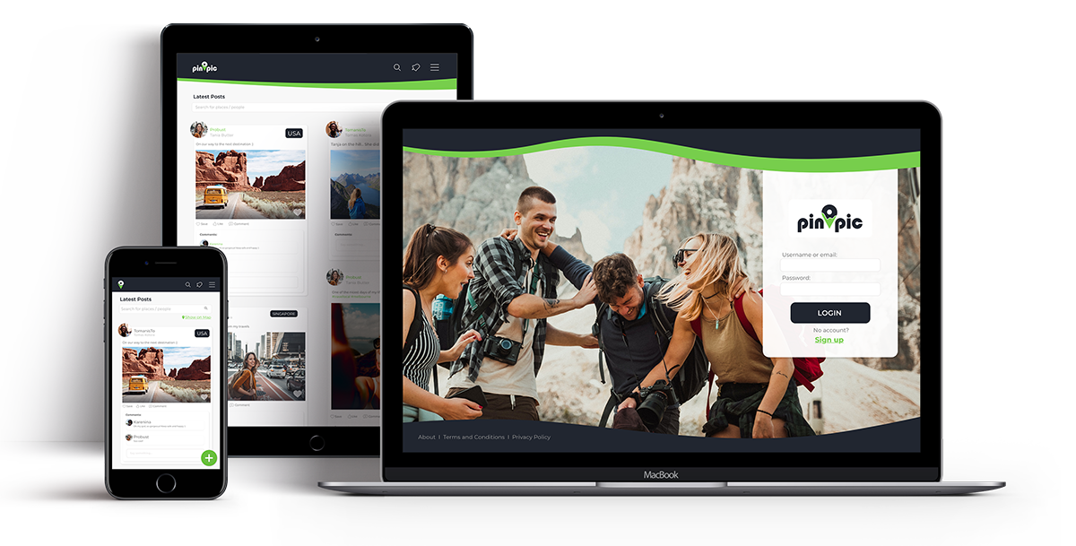
The PinPic concept
PinPic is a social media app that revolves around places and locations. Users capture images and videos during their travels, sharing them with their network — whether it’s a select group of connections or the public. What sets PinPic apart is its unique feature that allows users to tag precise geographical locations on their posts. This content can be found in the app’s media feed, displayed on an interactive map, or easily searched by location. It’s a tool that not only keeps users connected with their friends but also serves as a valuable resource for travel inspiration and planning their future adventures.

Research and ideation
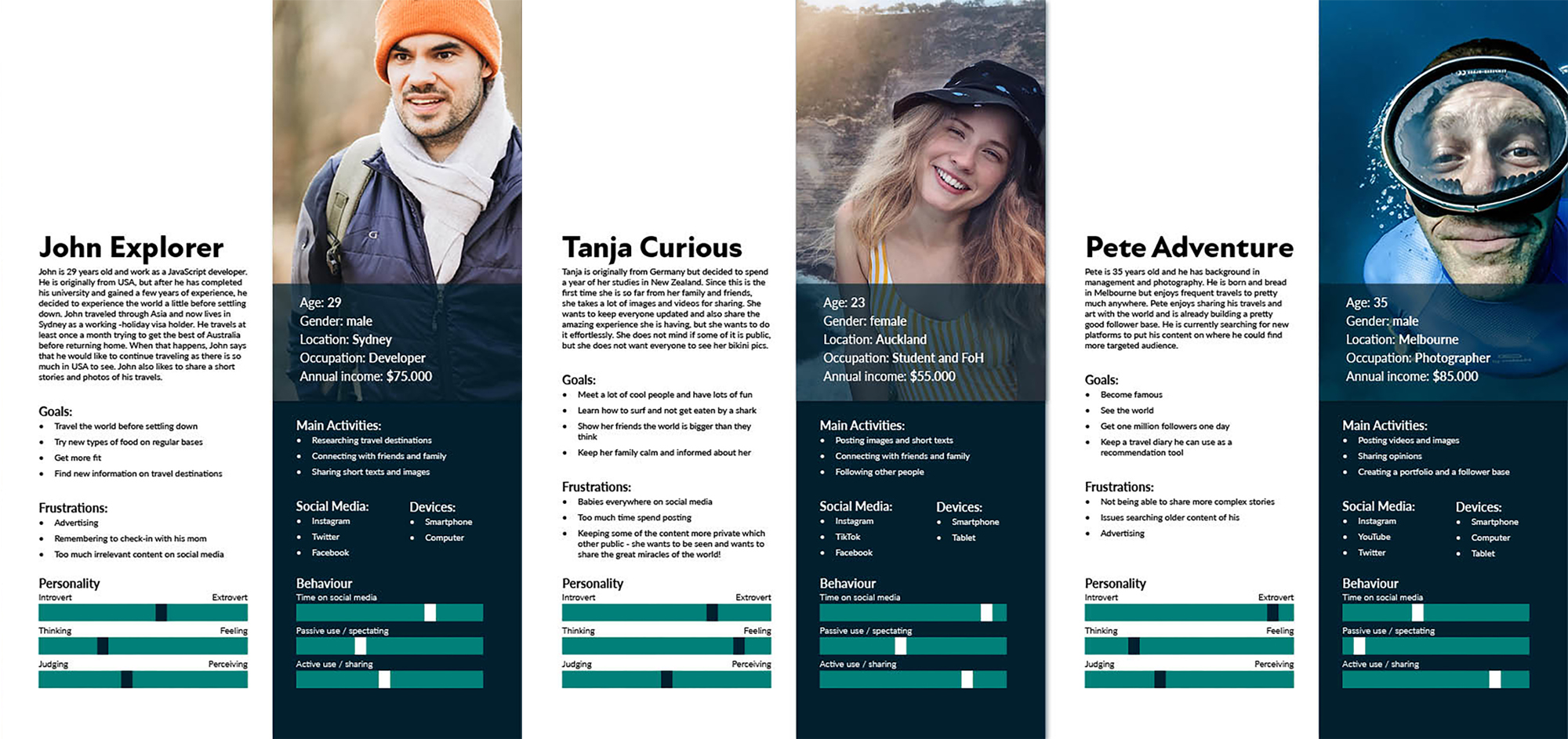
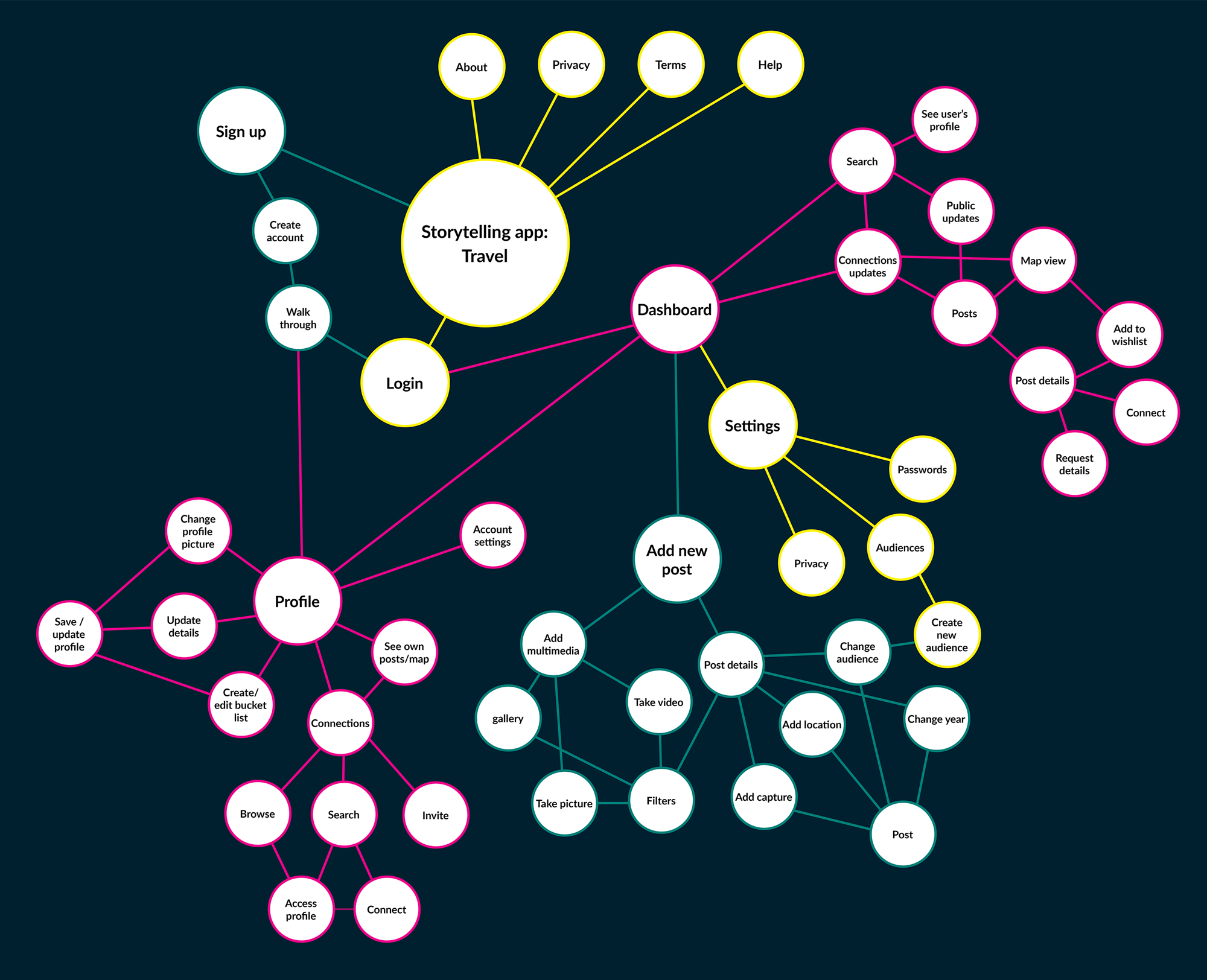
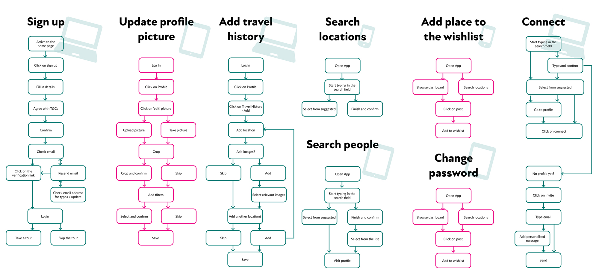
To ensure the refinement of the application concept, I conducted both primary and secondary research, incorporating surveys and in-depth analysis. The findings led to the development of user personas and scenarios that informed taxonomies, use cases, and user flows.
Paper prototyping and testing
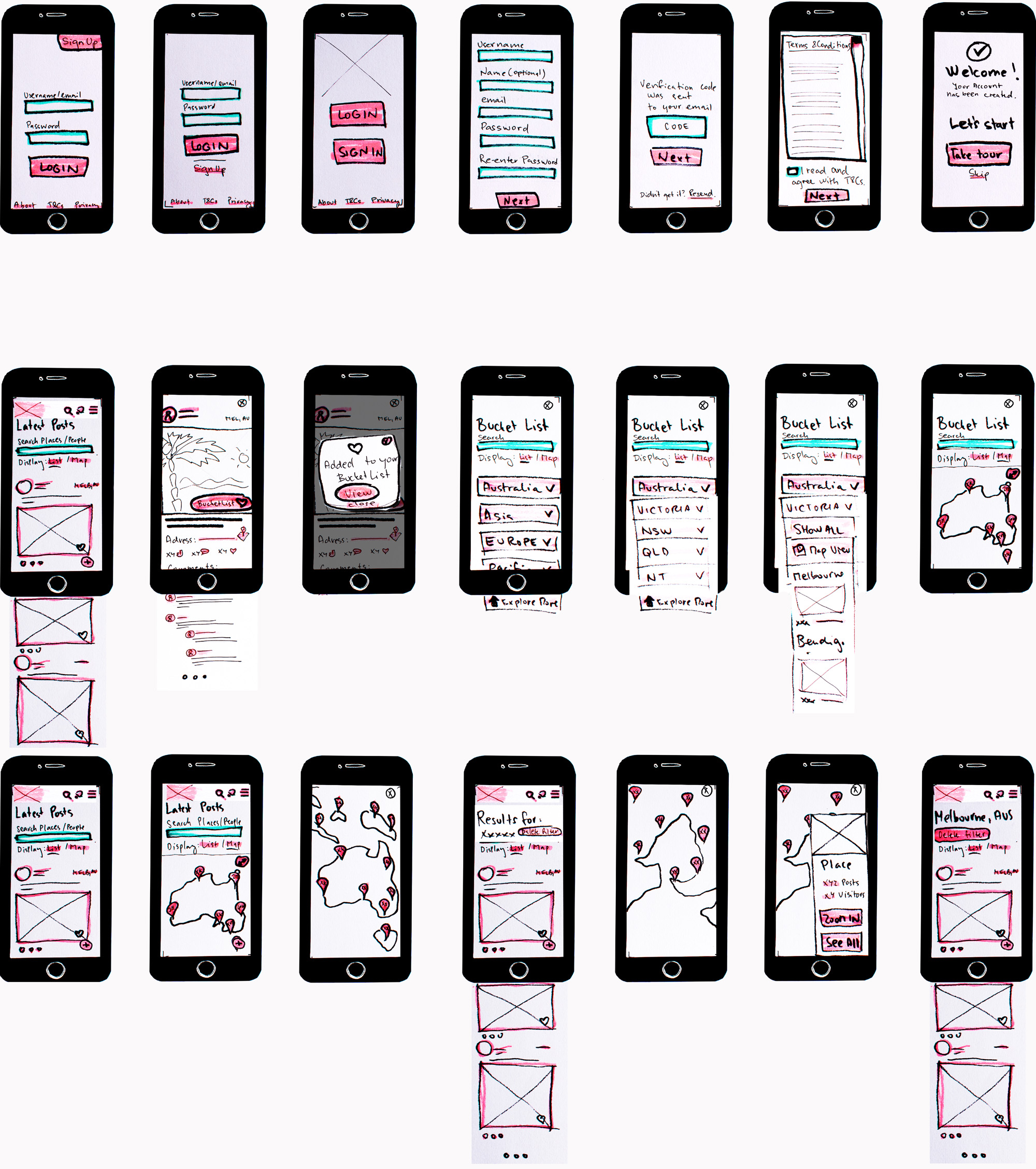
In the initial stage of user testing, I designed a set of paper prototypes that encompassed a wide range of tasks across various devices. These prototypes were evaluated by four participants, with the primary objective being to assess basic functionalities, identify usability issues, explore design variations, and gather suggestions for enhancements.

Naming and branding
The name “PinPic” captures the platform’s core functionality and purpose — allowing users to visually capture their travels, pinning them on a map for others to explore.
The logo combines the universally recognised map pin symbol with an image of a landscape. The placement of the pin’s hole subtly represents the sun rising over majestic mountains. The colour palette draws inspiration from both nature and urban environments, providing a base palette for website elements, accents, and error messages.
High-fidelity prototype
With branding and low-fidelity prototype testing completed, I moved on to creating a high-fidelity prototype using Adobe XD. This iteration underwent testing with new participants, leading to a fresh set of recommendations for refining task flows, functionalities, and design elements. Changes included providing more space around buttons, icon modifications, and eliminating redundant confirmation screens.


